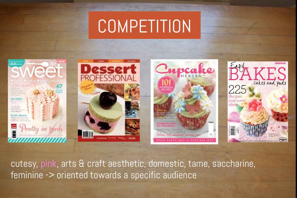
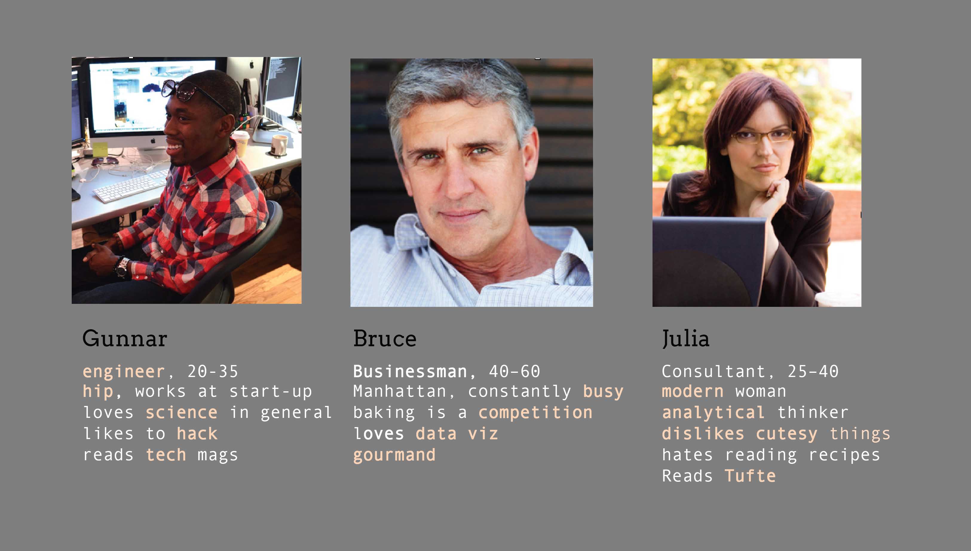
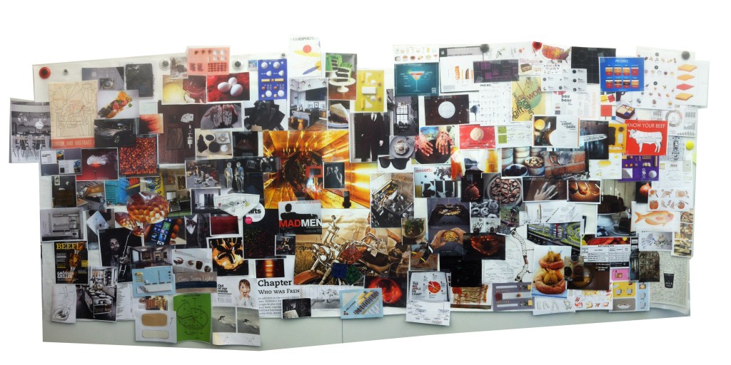
Design
Our e-magazine reflects our personas' sophisticated tastes. Their appetites for data and hunger to create drove our design on several levels. We gathered images which represented
- how they might enjoy dressing,
- how they experience cooking,
- what do their kitchens look like,
- and how they consume information.
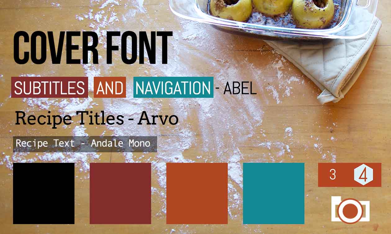
We distilled colors and fonts from the resulting
moodboard and identified other motifs, like light, color saturation, infographics, textures and the appearance of hands, to inform our design language.
INFORMATION DESIGN
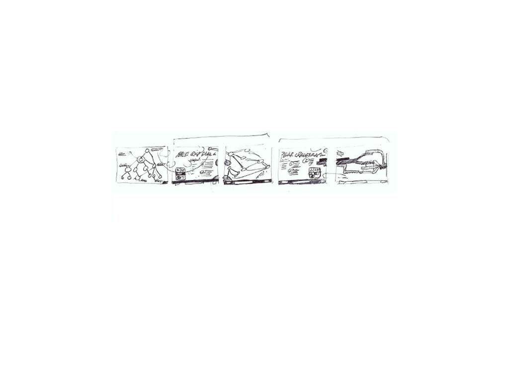
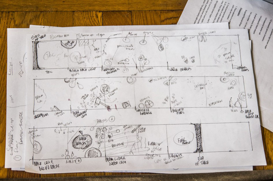
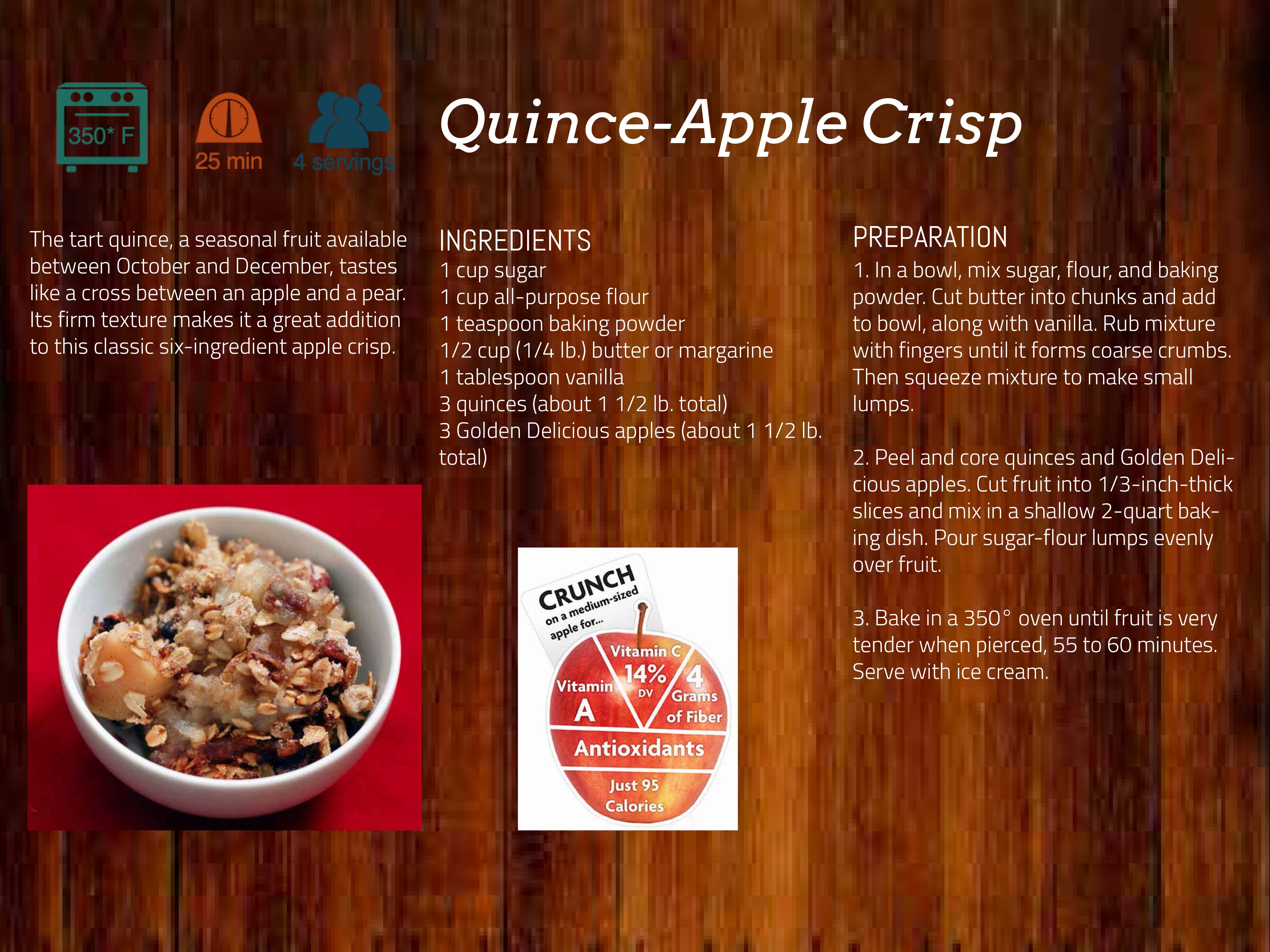
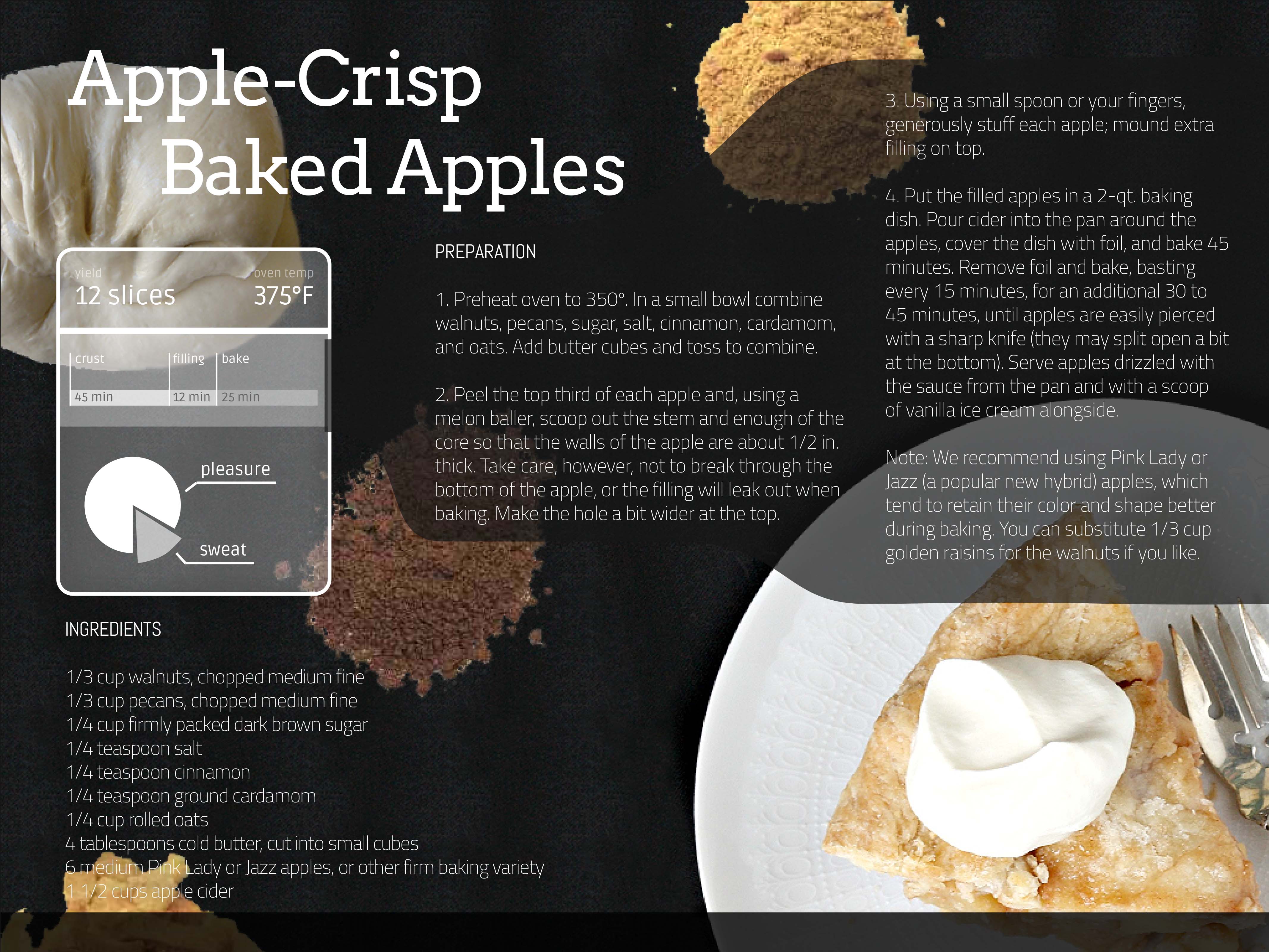
While the moodboard yielded a rich design palette, our personas would crave more than aesthetics. We pulled out recipe metadata, like time, temperature, and number of servings, and re-imagined the recipes as infographics. When we analyzed the recipes, we found we could in order to create a logical flow between them.
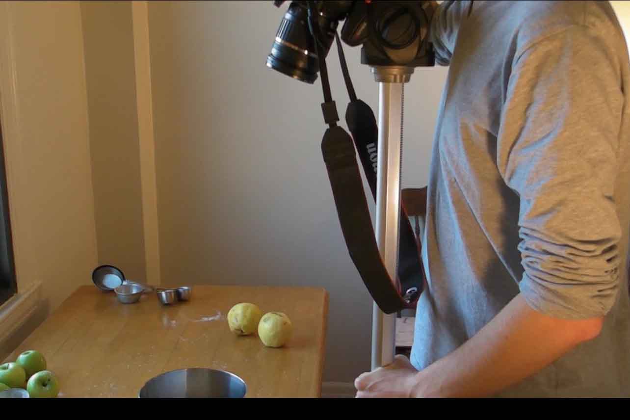
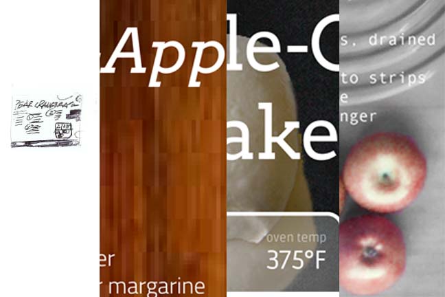
PHOTOGRAPHY
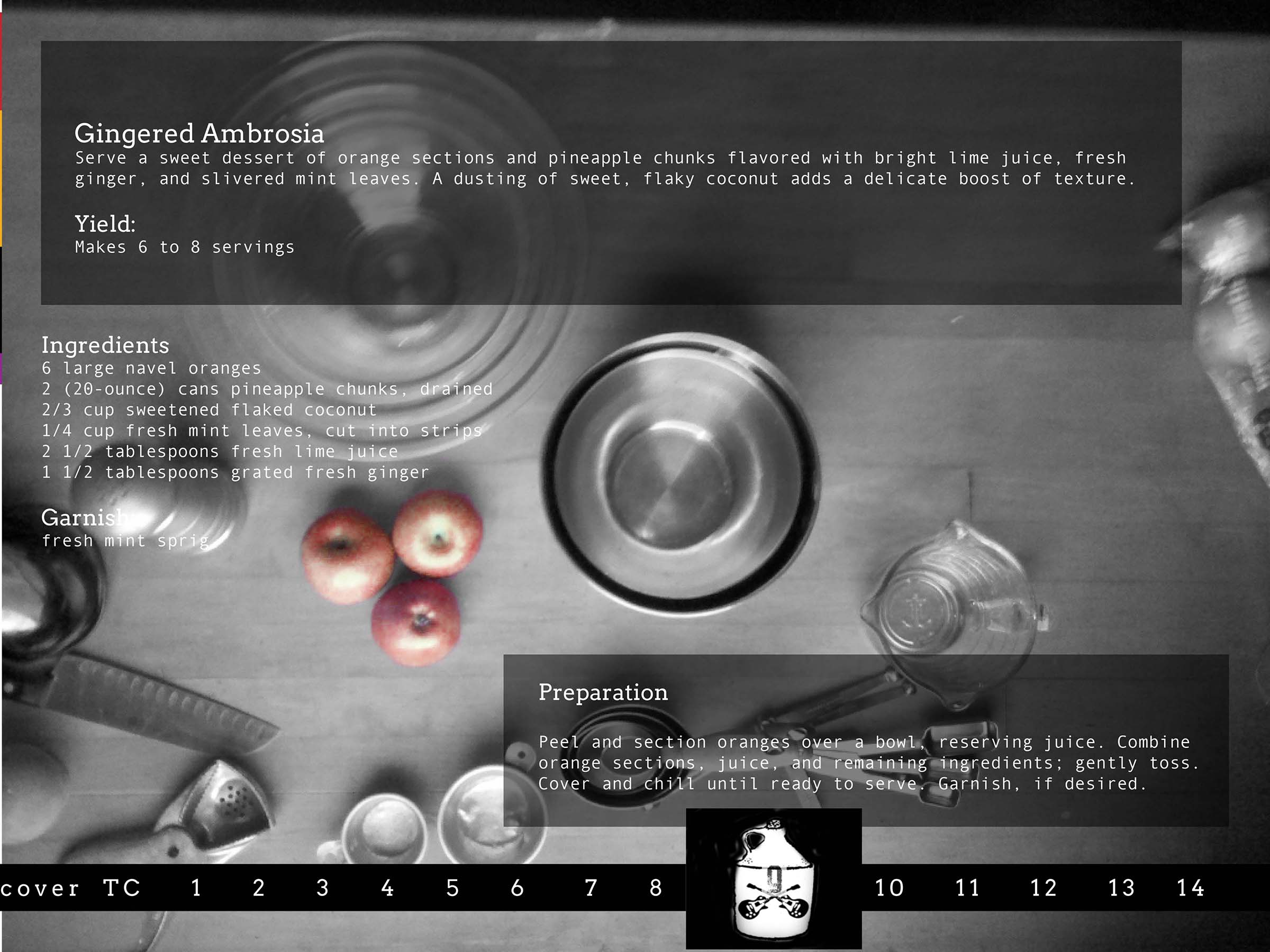
Rather than using stock photography or imagery found online, my team and I staged a photo shoot (on my kitchen table). The photographs simultaneously represented two narratives. Not only do the pictured ingredients tie to the recipe on that page, but the background photos also depict one step in how to make the last desert featured in the e-magazine.
INTERACTION DESIGN
Since we were restricted to using a PDF with no additional interaction, we turned this constraint into inspiration. We stitched and blended 21 photographs to create a continuous table.